A friend of mine (Max) was discussing about his presentation on Smart Cities. While going through it, he mentioned a twitter account that posts about air pollution data about Karachi: KarachiAir. The tweets are machine generated and are posted every hour. It’s a great step towards open data community and was a pleasent surprise for me to find it for Pakistani cities. Unfortunately, it is difficult to look at the big picture by looking at these tweets. Therefore, we thought about creating some visualizations using this data with some basic exploratory analysis. So we scraped the data from the twitter account using its timeline API; filtered it to get only quality measure tweets; parsed those tweets to get pm2.5 and air quality index and did some time series visualizations.
Exploration of Air pollution data in Karachi
It seems that the air quality index is increasing with the passage of time, whereas the pm2.5 metric is decreasing. If we pass our data through a moving average filter by using a one day window, this trend becomes more evident.
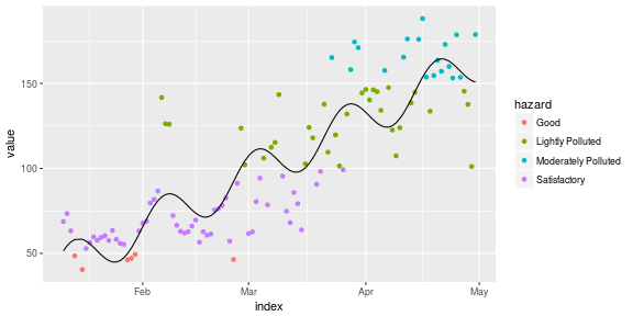
Finally, we look at the motion chart for this data, along with hazard levels based on pm2.5 values and air quality indexes as defined by BlissAir.
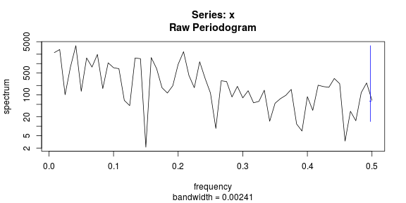
Since we have the data, and can see an increasing trend for the air quality index, we can fit a simple linear regression model to capture and forecast the air pollution. This can help us in taking preemptive measures and suggestions for policy makers. We have fitted a linear model, with the predictor variables as Time, and to capture the periodical variation: cos and sin functions of time. The frequency used for capturing this temporal variation was estimated by choosing the most dominant frequency of the signal by analyzing its power spectral density as shown in the code snippet below.
aqDat = dailyPoll2 %>% dplyr::filter(series == 'Air.Quality.Index')
Time = aqDat$index
AQI = aqDat$value
ssp <- spectrum(AQI)

per <- 1/ssp$freq[ssp$spec==max(ssp$spec)]
aqDat$xc = cos(2*pi*as.numeric(Time)/per)
aqDat$xs = sin(2*pi*as.numeric(Time)/per)
fit.lm <- lm(value ~ xc+xs +  as.numeric(index), data = aqDat)
pred <- predict(fit.lm)
With this, we proceed to visualize the trend line by using our prediction function.

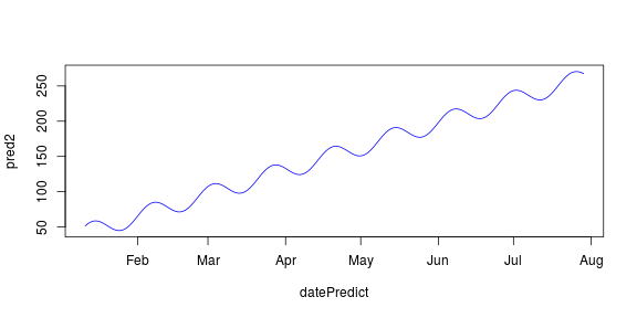
We can also forecast future values of the air pollution index, although, I’d like to mention the caveat of us having limited data, and almost no information about the location of sensor. Of course, with more observations over the years, we can see the trend going down or stabilizing after reaching some peak value (which is usually true with most signals). Regardless, the figure given below that predicts the pollution values for the next few months is quite bleak! It seems that we will soon make Karachi unbreathable.
